Design Tips
Choosing Finishes That Work Together
Undertone, metal, grout, wood tone and sheen decide whether a palette agrees with itself. Here is how to check each one before a single order goes in.
Palettes rarely come apart at the moment of choosing. They come apart on install day, when the cabinet white that looked crisp in the showroom lands beside a quartz that turns it yellow, and the tile you approved on a screen reads pink against both.
The useful part is that this is diagnosable. Materials agree or disagree for reasons you can learn to see in about twenty minutes, and nearly all of them come down to undertone, metal temperature, tone distance, sheen and patina.
See the undertone before you see the color
Every white, gray, beige and greige carries a bias underneath the color you think you are looking at. Held alone, your eye compensates, which is why everything looks fine in isolation. Put plain printer paper behind the sample and the bias appears: green, pink, yellow, blue or violet against that flat neutral field.
The paper test, in order
- Gather every light material at once: cabinet door, counter chip, one full tile, the trim drawdown, the grout sample.
- Slide plain printer paper under them all, in daylight, away from a window looking onto a green lawn.
- Name each lean out loud. Yellow, pink, green, blue, violet or neutral. Write it on a sticky note stuck to the sample.
- Group the notes. A palette holds when the leans are one family or clearly opposed. It goes muddy when two are almost the same and not quite.
A warm white beside a cool white looks like an error. A warm white beside a distinctly darker, cooler stone looks deliberate. Near misses read as cheap, not contrast.
Warm white and cool white under one roof
Most homes carry three or four whites: walls, trim and doors, cabinetry, and whatever the ceiling ends up being. They do not have to match. They do have to come from one family, so the trim reads as a crisper version of the wall rather than a separate idea.
Ceilings go wrong most often because nobody chooses them. A default builder white above a warm wall sits there like a cold lid. Have the ceiling mixed at half strength of the wall color, in flat.
A sample approved under showroom lighting is an opinion. The same sample approved on your own floor at four in the afternoon is a decision.
Mixing metals without it looking accidental
Two finishes in a room is comfortable. Three works when the third is small and clearly an accent. Four reads as accumulated rather than designed.
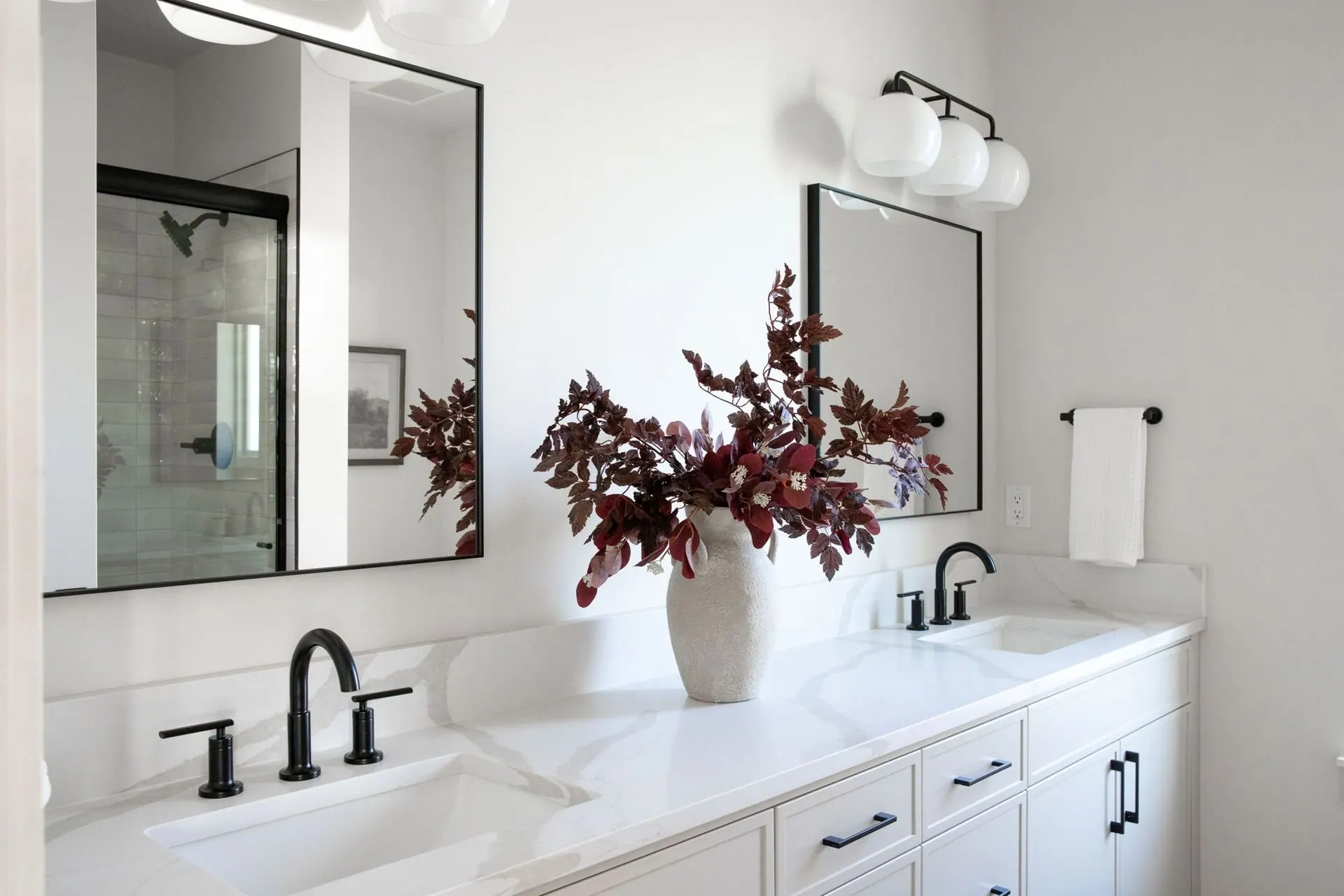
- Keep every metal in one plumbing group identical. Faucet, drain, pop-up and valve trim should match, ideally from one maker, since two brands rarely make the same brushed nickel.
- Let door and cabinet hardware be a separate decision. It reads as architecture rather than plumbing, so it can differ from the taps without tension.
- Choose living finishes on purpose. Unlacquered brass darkens and holds fingerprints within months, which is either the appeal or a slow irritation.
- Matte black shows every dried droplet, so a hard water shower asks to be wiped far more often than a brushed finish.
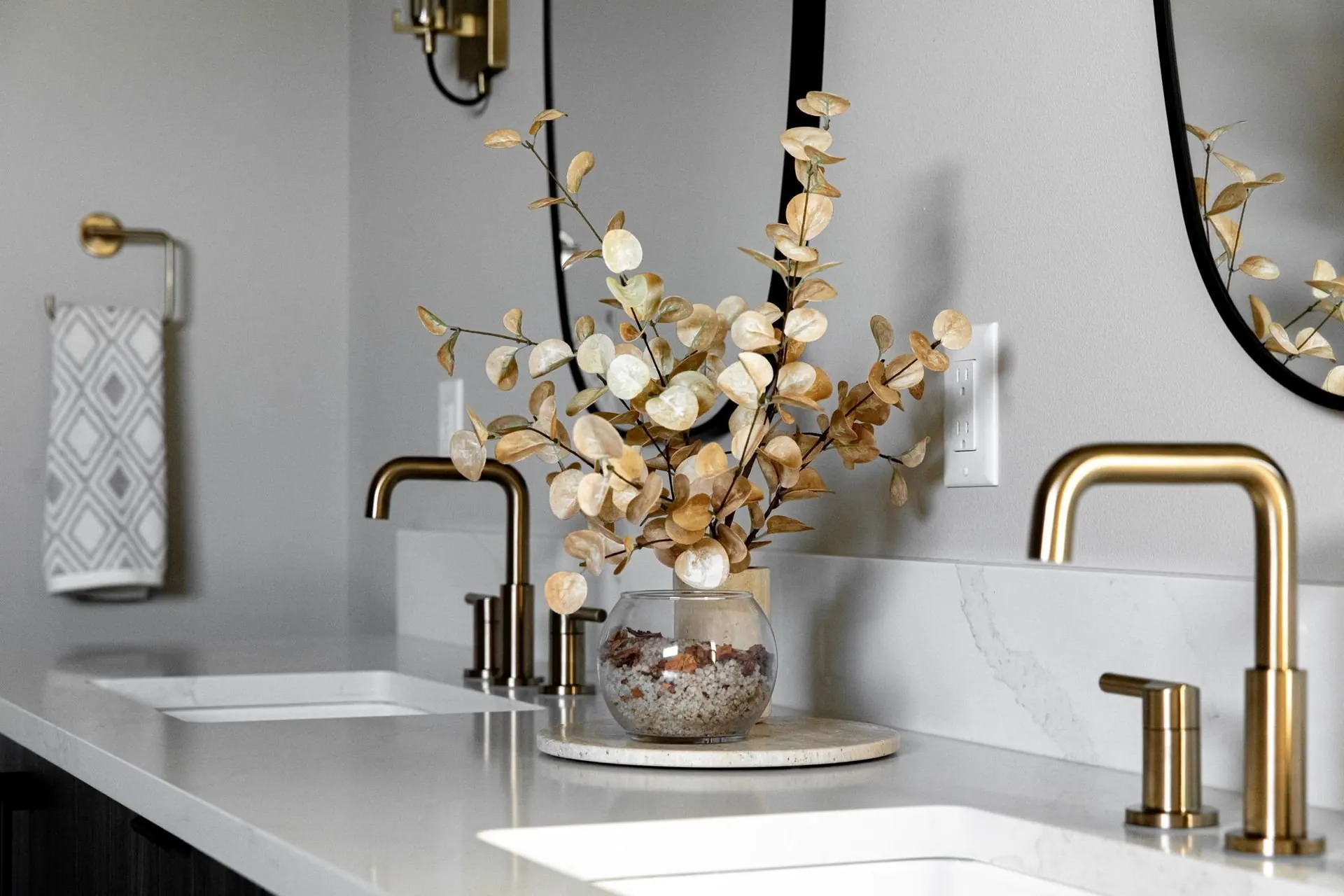
Metal temperature answers to undertone as well. Warm brass beside a pink-leaning white pushes both toward peach. Beside a green-leaning greige it calms down. When a metal misbehaves, the white next to it is usually the culprit.
Stone, and how much change you want to live with
A four inch chip cannot tell you what a slab does. Movement and vein direction only exist at full size. See the slabs standing upright at the yard, photograph each one with your cabinet door sample in the frame, and tag the ones you want held.
Ask the fabricator where the seams will fall, and whether the island and backsplash can come from one bundle. Slabs are cut in sequence, so neighbors in a stack look like relatives. Two bundles of one stone can look like two stones.
Polished, honed, leathered
Surface finish alters a stone about as much as the stone does, and the gap is wider in the hand than in any photograph. Ask to see one material in all three treatments. Leathered is the one most homeowners have never held, and it hides fingerprints best on a dark stone.
Then be honest about patina. Soapstone darkens, unlacquered brass dulls, and marble takes a ring from the first glass of lemon water left on it. If that sounds like character, the material is right. If it sounds like damage, choose something that stays put.
Grout is a design choice, and it is yours
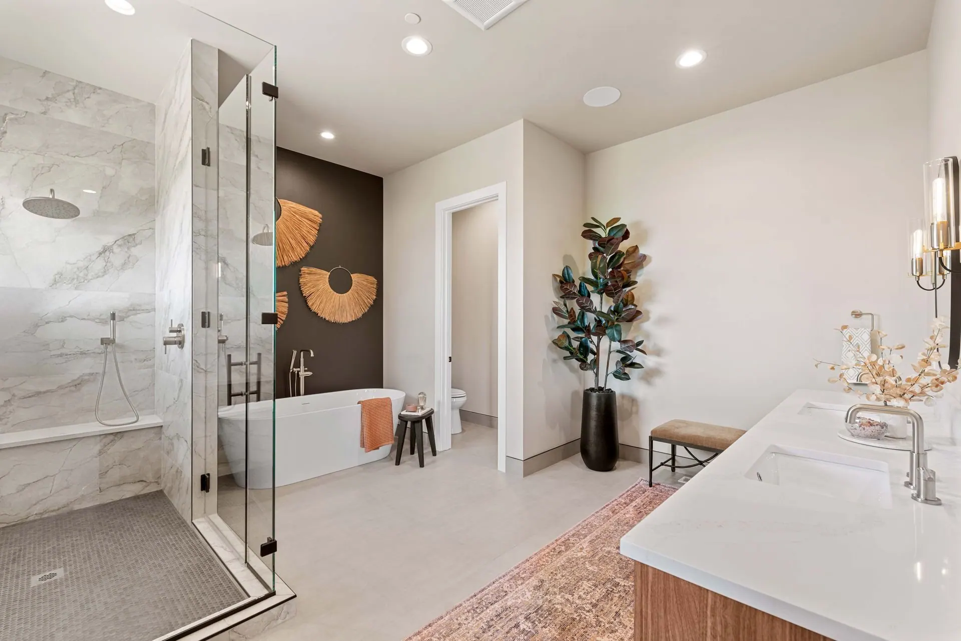
Grout gets decided by default more often than any other selection. If nobody specifies it, the tile setter picks something safe on install morning, usually a mid gray. That is an eighth of an inch of line repeated across a wall, and it decides whether you see a surface or a grid.
- Matching grout to tile makes the field read as one plane. That is what you want behind a range where the tile itself is the event.
- Contrasting grout draws the pattern forward. Good on a hexagon or a herringbone, tiring across a large plain wall.
- Cured grout dries two or three shades lighter than the wet sample. Judge it from a hardened grout stick, never from the bucket.
- White grout on a floor will not stay white. Go slightly darker than the tile in entries and mudrooms.
- Narrow joints take unsanded grout, wider joints need sanded. Confirm what your tile requires before you commit to a hairline joint.
Wood against wood, and wood against the floor
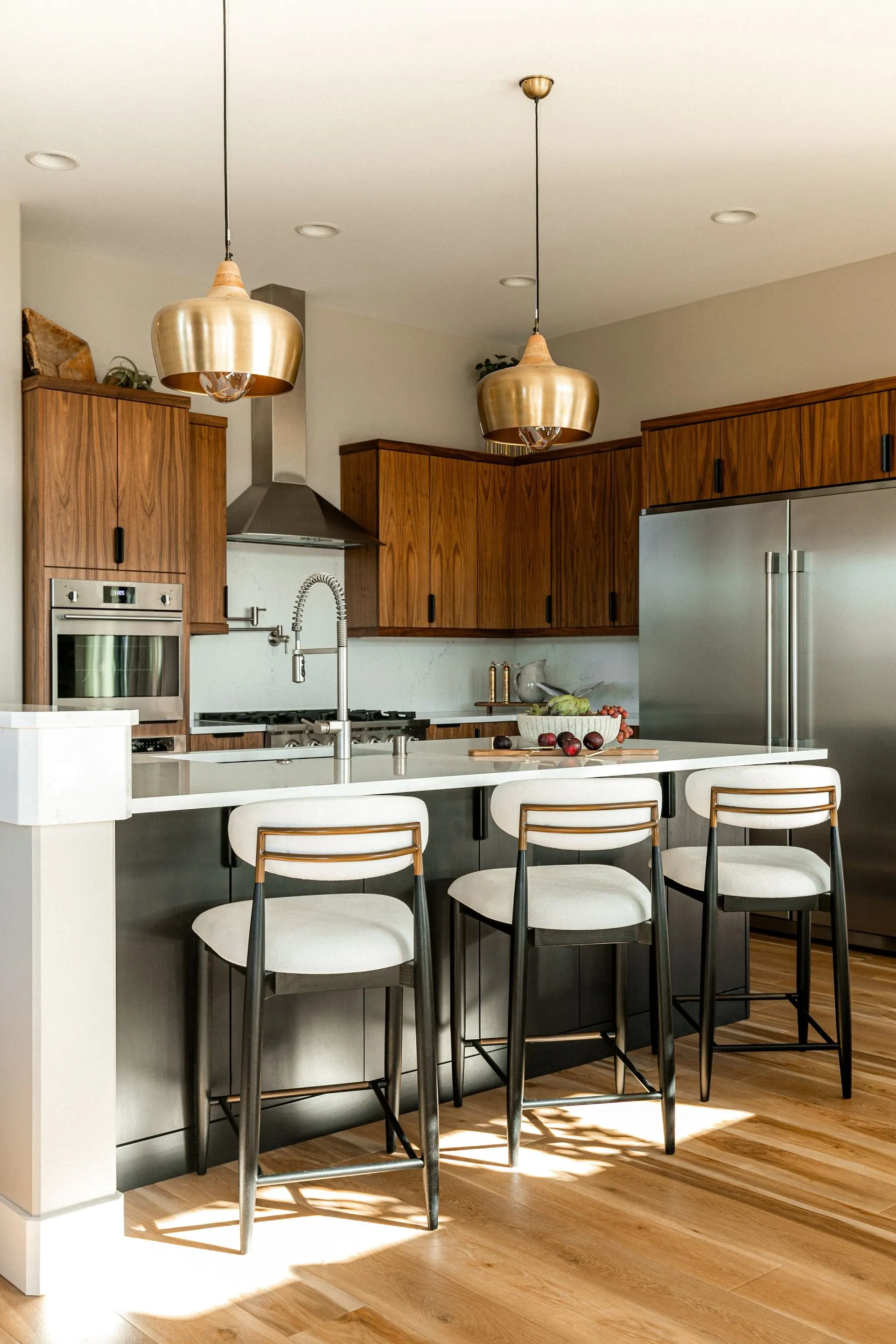
Two woods at almost the same tone look like one of them was a concession. Set the cabinet sample flat on the floor sample instead of holding it up alongside. Wood shifts with the angle of the light, and a floor is seen flat for life.
Then decide plainly: matching or contrasting. Matching means the same species, cut and finish. Contrasting means enough distance that nobody has to wonder, a pale rift sawn white oak floor under walnut cabinetry, say. Plain sawn oak carries big cathedral grain, rift sawn is quiet and linear, and the two rarely sit well in one sightline.
Watch for red. Older red oak floors and many stains lean orange, and orange argues with almost every cool white and gray stone. Where a floor is staying, its lean is the fixed point of the whole palette. That is the first thing we look for in remodel design consulting: what is staying, and what it is quietly dictating.
Sheen, the decision nobody writes down
Sheen changes color. The same paint in satin reads deeper than in matte, so a shade approved on a flat drawdown can surprise you on a semi gloss door. Approve every color in the sheen it will be painted in.
The working rule: flat on ceilings, matte or eggshell on walls, satin or semi gloss on trim, doors and cabinetry. The exception is a wall running alongside a long window, where light rakes sideways and anything shinier than matte shows every seam behind it.
Test in the room, three times in one day
Everything above is settled by one habit: look at the material where it will live, in the light it will live in.
- Paint two coats on a two foot square of primed board, not on the wall, so the old color cannot tint your judgment and the sample can move.
- Lay horizontal materials horizontally. A counter chip held upright catches light it will never see once installed.
- Look at nine in the morning, at two in the afternoon, and once after dark under the bulbs you intend to install.
- Check those bulbs first. Pick one color temperature for the whole house, usually 2700K or 3000K, and buy lamps rated above 90 for color rendering. A cheap 4000K bulb makes a warm white go gray.
- Leave it all in the room for a week. A palette that only works on a bright Saturday morning is not finished.
None of this requires a designer. It requires the discipline to slow down at the moment a project wants you to hurry, when the builder needs cabinet colors by Friday and the tile is on backorder. That is why finish and material selection is worth treating as its own piece of work. Keep one rule if nothing else: never approve a material alone, only beside what it will touch.